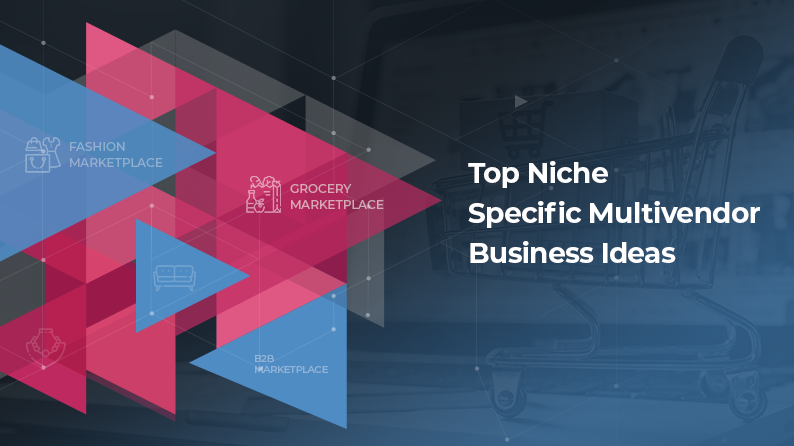
Multivendor marketplace is not a new concept in the online business world. Over the course of the last ten years, almost everyone has become aware of this business model. Discussions keep happening over the essential features a multivendor marketplace should have or how it should be successfully run. Getting the design right, however, is a different story altogether.
Speaking of designs, innumerable articles and blogs discuss about it over the internet. But one man has summed it up in one line for everyone.
“Design is not just what it looks like and feels like. Design is how it works.” – Steve Jobs
Though, many people would agree with Steve Jobs, not much is being done about it. The way he emphasized on design is exactly how multivendor marketplace owners should too. It’s all about creating a design that complements the marketplace’s functionality. A design is only as good as the purpose it solves.
In the past, bad designs have ruined many good solutions/platforms, from automobiles to apparels to websites. And this is why it’s important for us, the team behind Yo!Kart, to make products successful primarily through design and lead through example.
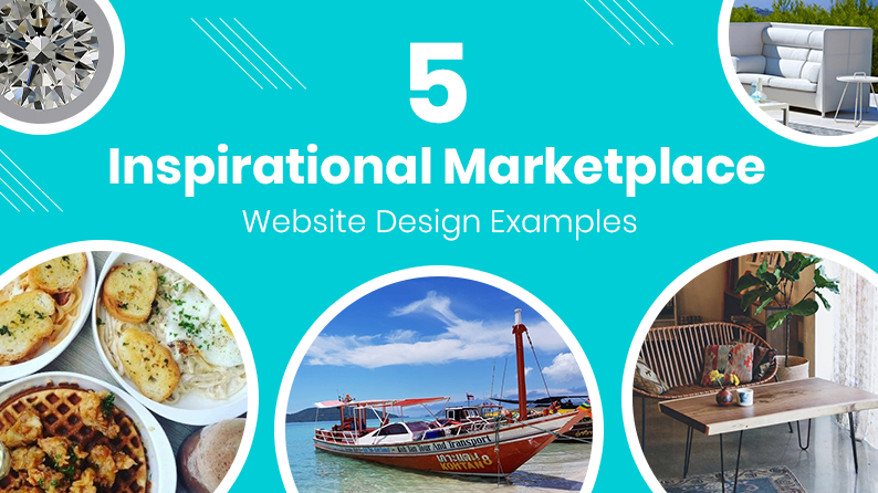
Many multivendor marketplaces focus on pragmatic designs that deliver excellent user experience. We drilled down to 5 excellent multivendor marketplace website design examples that helped these businesses gain better traffic, generate more leads and garner increased conversions.
Mangan
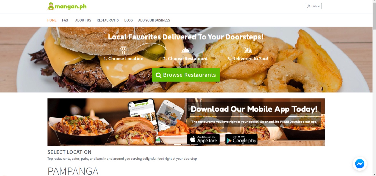
Built with a detailed front-end, Mangan is an online food ordering and delivery business that boasts of an everything-is-in-front-of-you kind of design. Apart from the homepage that straight away shows the most popular restaurants, navigating to Mangan’s other pages/tabs is a breeze.
What makes this design inspiring?
To begin with, the neat and well laid display enhances customers’ buying journey. There’s one noticeable element in the chat support; you get connected to Mangan through your Facebook messenger. This particular feature, although a part of development, is designed strategically to inform you that you are interacting via Facebook messenger. Clever and minimalistic, something that is in absolute contrast with an otherwise bold web design!
What can you learn from Mangan’s design?
One look at Mangan’s website and you can easily figure out that a neatly laid out design can engage and convert better.
This brings us to our next marketplace web design inspiration.
UNI Diamonds
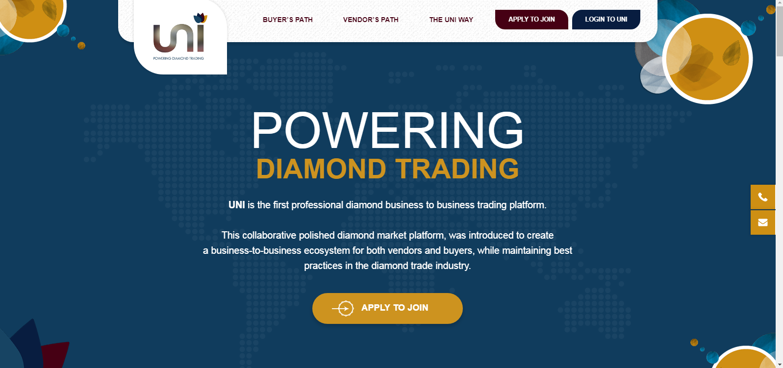
Aimed at developing a powerful, transparent network of diamond sellers and buyers, UNI Diamonds is an online B2B diamond trading marketplace that is easy to navigate through and use. What makes the design of this marketplace special is its aesthetic appeal inculcated in simplicity. The website is informative and uses 3D, animated images of diamonds, which add to its appeal.
What makes this design inspiring?
A marketplace’s design plays a key role in creating its user experience. Therefore, the Yo!Kart team delivered a minimalist marketplace design for UNI Diamonds that could ensure faster loading speed and ease of use. Now, buyers and sellers can easily sign up with the marketplace and start direct interaction with each other.
The marketplace is focused completely on diamond trading and so it encourages diamond traders to begin without hassle via its user-friendly interface.
For enabling day-to-day operations, the multivendor marketplace also comes in the form of Android and iOS mobile apps, which are intricately designed, yet responsive in nature, and quick and convenient to operate.
Read Case Study: UNI Diamonds – First B2B Diamond Trading Marketplace
What can you learn from UNI Diamonds’ design?
‘User experience is of utmost importance’ is the first message that UNI Diamonds conveys through its design framework. It tells you how you must keep it simple, yet elegant to keep visitors coming and joining you.
Also, high quality images are essential along with succinct and clear information to keep the marketplace design neat and immaculate. For UNI Diamonds, their brand story is of high importance, which reflects on their website.
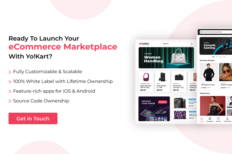
Ready to quickly build a similar multivendor marketplace of your own?
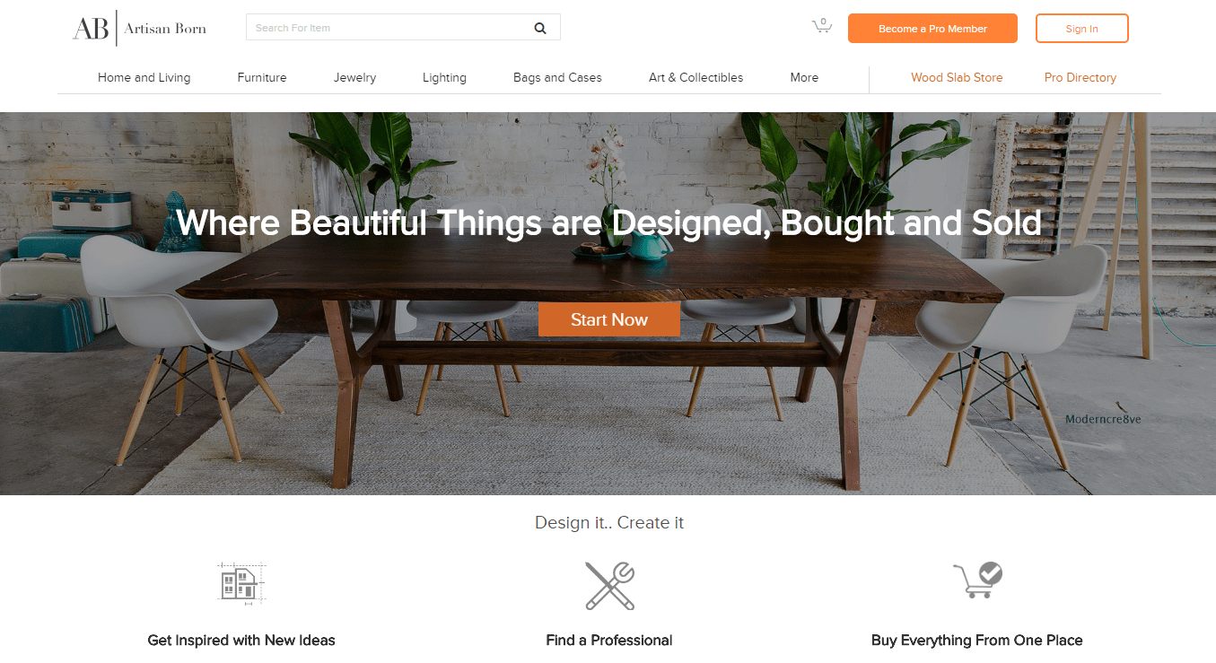
Rarely do you come across online marketplace designs that are as breathtaking as Artisan Born. The moment the website loads, you get to know what these guys are good at. Artisan Born is a custom marketplace that features works of many talented craftsmen. The overall website is carefully divided into various tabs. Each page of the multivendor eCommerce platform delivers a good viewing and browsing experience.
What makes this design inspiring?
A neat design with elements of minimalism brings attention to things that matter —the products. Anything that draws you away from the primary objective is excluded; Artisan Born is all about craftsmanship and connecting customers with sellers who can fulfill their personalized furniture requirements. The carousel slider showing the recommended products enhances user experience.
Latest offers further educate the customer as to what deal they can grab. Above all this, the category tab is what takes our attention the most. It’s quick to load and moving from category selection to buying an item, everything is a breeze.
What can you learn from Artisan Born’s design?
Minimalism combined with easy navigation and web optimized pages, Artisan Born stands proud with all the necessary elements integrated brilliantly.
From Mangan’s all-out design to Artisan Born’s minimalistic and innovative approach, we are done with two inspirations poles apart from each other. It’s time to look at the 4th multi-vendor website design inspiration, let’s see where it takes us…
Footloos
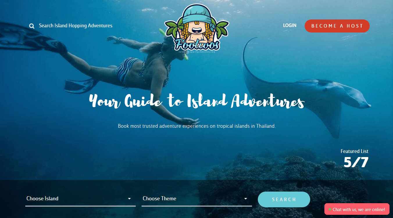
Rarely do you come across travel marketplaces that are as engaging as Footloos. This marketplace is all about travel activity. The website has an immersive experience, and the more you explore it, the more you get immersed in the activities. When it comes to engaging the audience, looks like Footloos has figured it all out.
Also Read: Consider These Factors to Select the Best Multivendor Ecommerce Platform
From a theme based adventure to an island of your choice to any activity you like, you can choose what you want your vacation to revolve around.
What makes this design inspiring?
Immersive experience throughout the online marketplace is what keeps you hooked to Footloos. From easy usability to carefully curated graphic and written content, the more you explore this website, the more you want to go for a vacation. Footloos is all about delivering an experience, whether it is on the marketplace or on vacation. It makes you feel alive, it makes you feel good, and that’s all that matters.
What can you learn from Footloos’ design?
The first thing you learn from Footloos is “Always focus on user experience.” It’s absolutely remarkable how easily one can navigate on Footloos. From searching an activity to booking it, everything works like a charm. And then there is the way the website indulges its audience, which is nothing short of an inspiration.
As a wise man once said, “Inspiration can come from anywhere,” let’s see where our next online marketplace design inspiration comes from…
FDX Online
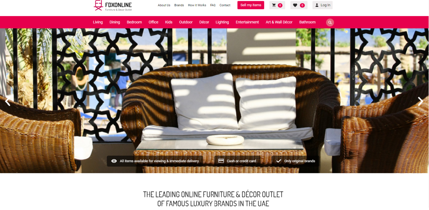
Designed keeping in mind the significance of the first impression, FDX Online is an online, multivendor furniture and décor outlet based in the UAE. To cater perfectly to each of their target audiences, FDX has designed a fast and outstandingly visible navigation menu bar at the top of their website. The marketplace makes it clear in the first visit how it works for its prospective customers.
What makes this design inspiring?
First things first. The Yo!Kart-powered marketplace has a classic design rooted in the basic white background layout. The home page beautifully displays the featured items to make potential buyers convert without giving it a second thought. High resolution images used throughout the marketplace make it a delight to traverse through and shop from it.
Check out this infographic: Launching an Online Marketplace Gets Easier with These Handy Themes
Sellers can register with the marketplace in a few quick steps and start selling the inventory they own. For buyers, the payment procedure is safe as the payment reaches the vendors only after the ordered item is accepted by the buyer.
What can you learn from FDX’s (Furniture and Décor Exchange) design?
Because design makes a difference, you must make it artistic and uncluttered. Without a doubt, it should be such that users find it easy to understand and use. FDX’s marketplace model lays huge emphasis on images, which are eye-catching and of the highest quality.
Major focus has been kept on keeping the platform safe and convenient for buyers and sellers. There is no room for any redundant element on the marketplace, where sellers can easily list their products and buyers can effortlessly browse through the listed products.
The point is, any multivendor marketplace website that you look at has something to teach you. It all depends on you, how receptive you are to learn.
Internet has an abundance of impeccably designed marketplace websites, and choosing the ones that caught our attention wasn’t remotely easy. While curating this list, we took special notice of the practicality of the design— often the work of a skilled custom web design agency — how it enhances user experience, the way it eases movement across the marketplace, and how quickly you move through the checkout.
Design Your Multivendor Marketplace using a Future-Proof Solution
Create The Next Best Ecommerce Marketplace Design That Inspires
Contact UsPopular Posts