

Updated On: 19th May 2023
Choosing the right colors while designing your website is more than just making the design look good and enticing, it’s about building a brand that sticks.
Think of Amazon, what is the first thought that comes to your mind, a yellow-orange arrow, smiling from A to Z, right? Ever wondered how, despite its minimal design, Amazon does such an amazing business? What was their approach while finalizing the design of their website?
It’s not just Amazon, for any successful website you look at has something different. Every website belonging to a particular niche has something that stands out from the rest. What’s about a website that makes us want to visit them more often than others?
It’s the design, and when I say design, that means a website high on user experience. This is why everyone should know the art of web designing, or know someone who does.
While choosing the design and colors of a website, the core idea is to maintain the design-functionality equilibrium. And whenever in doubt, take note of your website and see the industry it belongs to. While it’s a common practice to give precedence to functionality, overlooking design completely is not a good business practice.
But it’s easier said than done, right? Yes, because choosing & mixing different colors is a delicate task. Even a slight mismatch can make a website look bland or tacky.
Apart from the rare exceptions, monochrome approach is easy to forget. So what should one do? The answers are right here- from color of the logo to navigation to CTAs. Let’s begin.
First of all, choose the base color scheme of your website.Don’t let your emotions and aesthetic preferences cloud your decision.
Concentrate on the most important factor: User Experience. Done? Good. Now, remember, everything from here will be based on the color scheme.
Before you read further, carefully study the color wheel shown below.
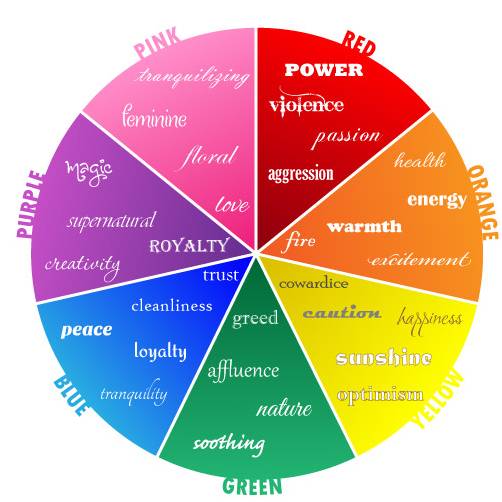
(Image Courtesy: CreativeBloq)
Launch A UI/UX Friendly Ecommerce Marketplace
Legend of Logo
The first and foremost factor you need to consider while designing a logo is that it’s going to be your brand representative all over the world.
Whether you run your business on a local, pan-national or global level,your company logo is the first thing that people will relate to.Let’s discuss how to choose the color of the logo.
1. Begin with defining the purpose:
Pay attention to the product and/or services you are delivering. Decide how you want to come across. Do you want your business to come across as elegant, formal, adventurous, trendy or casual?
The color and style of alogo express nature of the business. Use the color wheel given above to understand what different colors denote.
Also Read: Important Elements of an Ecommerce Marketplace Homepage
2. Invest time in research:
Hasty decisions have led to disastrous outcomes more often than not. Any logo that sticks in your mind is a result of extensive brainstorming. You don’t need to be acreativegenius to ensure your designs resonate with your business idea and goals.You simply need to be analytical enough.
3. Get things done:
Talk to a professional designer if you can’t fathom a clear, crisp and precise logo. There’s a reason why many companies specialize in logo designing. If your budget doesn’t allow you to invest in a logo design company, start researching on logo designs and gather some ideas. Take these ideas to a freelancer so that you can get a clear, well-defined logo that echoes with your company and its nature. A logo has a lot of components, including trademark and other legalities attached to it. So get it right as soon as possible.
Most Important Point: Don’t Make It Look Like Any Other Logo. Keep It Original, Make It Express Your Business and Stand Out.
Nuances of Navigation
Navigation is all about guiding website viewers where to go next. For first time visitors, use assertive colors to guide them. A contrasting and compelling color will stand out, grab attention and trigger the desire to click.
The primary navigational aspects of a website are:
- Headings
- Navigation Menus
- Hyperlinks
- Buttons
- Horizontal lines
Coloring navigation elements in the shades of the base theme will make them absolutely impossible to ignore.
Also Read: Key Purchase Drivers Every Ecommerce Store Should Have
Think of it as directional signs you would use in your physical store. You wouldn’t want the signboards to be plain and boring, right? It’s all about keeping the theme intact.
Promising Product Images
Needless to say, the background of your product images should accentuate your catalog. Arranging different product images in the catalog is also an art. Make sure you use a light-dark altering combination of backgrounds so that eyes are able to register every product.Product catalog is where revenue generation begins, so you need to make sure this particular page is designed impeccably.
While doing so, there are three different ways to choose the color of the background:
- Stick to the basic product image rulebook and go for white and other plain shades.
- Stay in line with the color theme and choose a color that highlights the product.
- Try the avant-garde approach and go for complementing colors.
Remember, this whole story is revolving around user experience and not how you want your website to look like.
The most common approach used by themajority of ecommerce store owners is to stay with the color theme. The first approach is not used much because of its blandness. The third one is tricky and has more chances of failure than success. As a result, few store owners dare to go down that road.
How To Start Design Rich Ecommerce Marketplace
Captivating CTA
CTA is possibly the smallest and yet the most important weapon in your arsenal.CTA doesn’t take a lot of space on a webpage, and yet it has the most important role in your business: conversion.
The color of CTA must resonate with the base theme, and that doesn’tmean experimenting with colors is not recommended. This is the point where the creative itch and the need to be spot-on relevant join hands.
CTA is that portion of the webpage where you can try all colors. The idea is to break the color theme and bring a message that grabs instant attention. However, the color chosen must induce the desire to act, not the desire to close the tab.
Blue, yellow, red and orange are the most captivating colors. Use solid colors or combinations that stand apart from the webpage and enhance user experience.
The key lies in placing the CTA strategically. It should grab viewers’ attention in a timely manner. Use words and colors that drive action.
When you come to think about it, choosing right colors for your website at the first go is almost impossible. It’s a process that demands time and patience. The points we discussed above will help you pave a clearer path towards an enticing ecommerce marketplace. Here’s a brief recap to help you:
- Finalize the base color scheme
- Design a resonating logo
- Work on navigation
- Set product image display
- Create complementing and contrasting CTAs
Remember, design grabs attention and functionality keeps the viewers fixed. Design your website right and half the game is already yours.